Large-scale study of attention change trends using ngrams

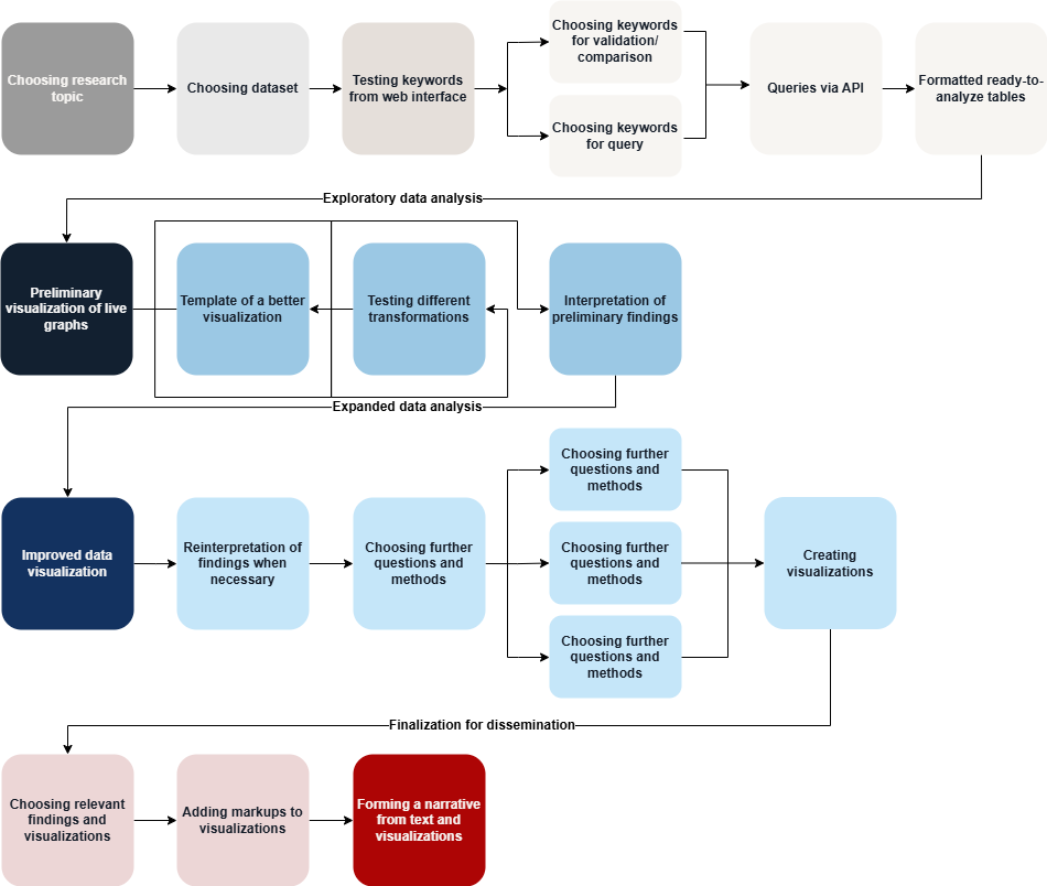
The workflow enables the analysis of mention frequencies across different categories over long time periods or with dense data, in order to reveal similarities and emerging patterns. Data is aggregated into matrices, which are used to createheatmapsthat allow large datasets to be presented visually in a clear and comparable manner. These visuals can be read both across time and across categories, enabling the comparison of different periods and topics, and combining intuitive qualitative visual analysis with quantitative methods. Mathematical transformations (e.g., normalization and logarithmic transformation) are applied to highlight relationships from different perspectives, especially when data values vary greatly. Additional perspectives are provided by other data science methods, such as time series vectorization and clustering.

In our example, we studied the mention frequency of the word “Ukraine” in 28 different languages over 15 years in the Twitter (now X) dataset, based on data obtained from the public API. The goal was to understand how and when attention directed at Ukraine in different languages increased or decreased.

Workflow steps

Keywords: Conceptualization, Discovering, Inquiries, Preprocessing

The goal of this stage was to select the research topic, initial research questions, and dataset, as well as to download the data and format it appropriately. In our example study, we used the Storywrangler open data API, which contains Twitter tweet usage frequencies over its usage history, until the closure of large-scale scientific use of Twitter in 2023. The goal was to obtain frequencies of tweets concerning Ukraine. For this, we selected the most suitable keywords referring to “Ukraine” in different languages, which involved translation and conducting initial test searches in the database.

Each downloaded keyword was added to a single table containing the category of interest (in our example, language) and the frequency for each day over a 15-year period. This table serves as the input for further analysis.

Keywords: Data Visualization, Preprocessing, Exploration, Sequence alignment

This stage consisted of creating initial data plots through trial and error, which provided an overview of the dataset and helped identify the most important patterns. First, we experimented with line charts, which are difficult to read for distinguishing and comparing 28 variables, then we created an initial version of a heatmap in Excel. We also experimented with different transformations, such as logarithmic scale and accounting for the expected attention share in different languages.

As a result of this stage, an initial overview of the data and key findings was obtained. The most useful data transformation methods and visualization approaches for providing an overview were identified.

Keywords: Data Visualization, Exploration, Sequence alignment, Distance measurement, Principal component analysis, Cluster analysis

In this stage, we analyzed the initial results and visualizations and created more precise figures and additional analyses based on them. We transferred the initial heatmap created in Excel to Python and selected suitable libraries and visual expression methods. Additionally, we applied vector analysis and clustering for closer analysis, along with supporting visualizations.

For the additional analyses, we drew on the initial results, which pointed to the most significant time periods according to languages, such as, expectedly, the 2014 and 2022 Russian invasions of Ukraine. The result was visualizations based on multiple computational methods and overviews of the main patterns.

Keywords: Visual analysis, Modeling, Theorizing, Contextualizing, Design, Writing

The goal of this stage was to systematically record and interpret the results that emerged from the previous analyses, and to annotate visualizations where necessary. We refined figures to highlight the most important aspects (such as specific events or periods) and developed a suitable narrative for presentations and scientific articles.

For example, we selected the most central visualizations and annotated them in image editing software. We confirmed suitable theoretical frameworks and finalized the literature review. We organized the article and figures based on the narrative, for instance by dividing the analysis sections into micro-, meso-, and macro-levels, which related different methods and results to each other.